


MARIAH CAREY TYPOGRAPHY
CD COVER
The letter forms used in Mariah Carey's CD covers are classy, elegant and easy to read , Mariah Carey is famous for singing ballads, R&B and hip hop, the typography in her CD covers relate to her music and character which is glamour and grand also most of the typography is San Serif ,all have the same height and there is a distance between the letters (kerning).
The use of colour in the letter form is vivid and vibrant since Mariah's music is joyful and in high spirit, the colours are also very feminine the use of pinks and purples makes the letter forms look girly which suites Mariah Carey's character and music.
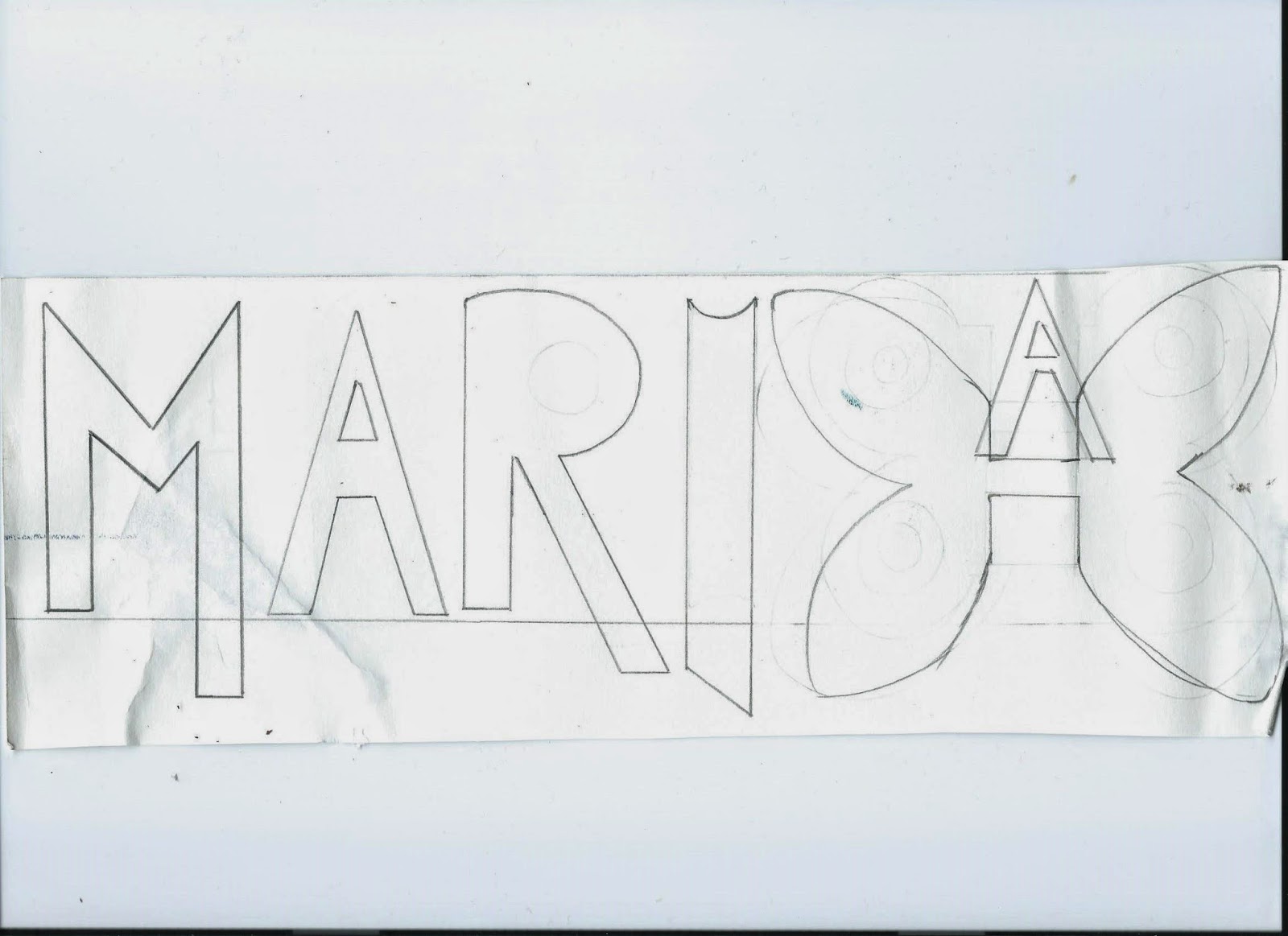
I started making my own letter forms for my CD cover and I wanted to do something that represents Mariah Carey to the same audience. Since butterfly's are Mariah's symbol I decided to make the 'H' look like a butterfly which makes the whole name look personalised moreover the letter forms in Mariah CD cover are colourful likewise I chose a bright neon yellow and orange which to me looks like gold, summer and sun it suites Mariah's character and music as most of her music is beach and summer inspired.


No comments:
Post a Comment