
 The first thing I noticed about the poster is the colour contact as the red writing stands out against the green background, at first I thought the letterforms are flames then I looked closely realised it was writing.
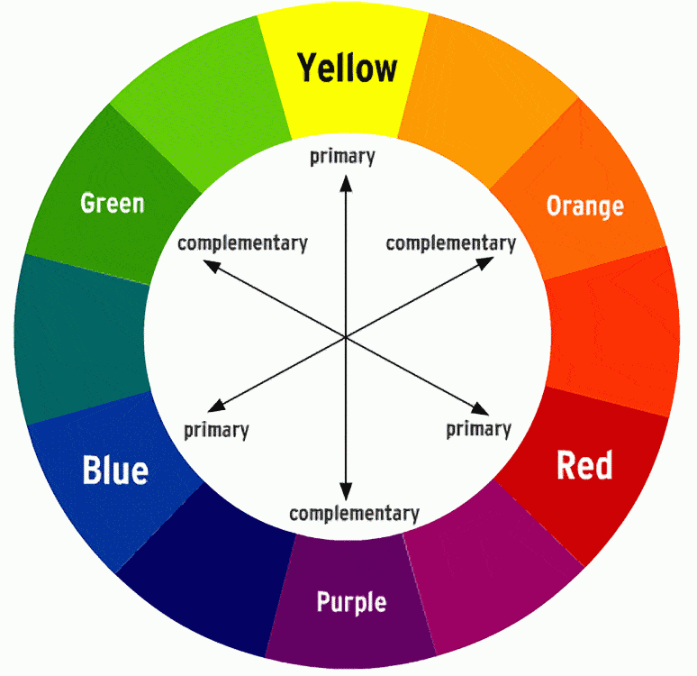
 The colour used is complementary colours and they are located opposite each other in the colour wheel. The letter forms are very hard to read called psychedelic font invented by Wes Wilson around 1966 which look like they were moving or melting which means you have to be in the culture to be able to read it since its made this way for not everyone to read , the use of colour is vibrant and vivid.
I am going to compare Alphonse Mucha right and left is Wes Wilson. From both paintings you can see some similarities such as the busy and complicated layout in Wilson poster you can see a lot of curves and different shapes you can also see letterforms that look like ocean waves they almost look moving like waves similarly with Mucha I see curves and curls I also see the boarder very busy with different shapes of leaves and plants, you can also see circular shapes. Both painting/poster are outdoor inspired to me since Wilson has a ocean theme and Mucha has a garden theme however the use of colour is very different Mochas painting has soft romantic colours which you can find in nature while Wilsons poster the colours are opaque, strong and eye catching. Wes Wilson is trying to communicate freedom through his art work since his art is inspired by rock music drugs and love on the other hand Mucha was very much inspired by theatre and beautiful women so he painted women in flawy hair and flowers around them.


VICTOR MOSCOSO
 The letterforms are bold and curved you can also see a stroke where the pen lets of at the end of the letters, all letterforms are the same height however you can see a descender that drops below the base line all letters are san serif and you can see areas of negative space which is counter. Is different because it was not used before, people in the 60s were trying to change society into a positive change by using vibrant bright colours and by doing different shapes and typography and also by music which inspired Wilson and Moscoso.
Mocsoso ans Wilson communicate the atmosphere or the attitude of the late 1960s as anti establishment and trying to be different from society the use of neon vibrant colours is what attracts my attention the most also the 1960 was the time where people had rights and most artist felt free to express their emotions through art and this is what Wilson and Moscoso did.
No comments:
Post a Comment