Monday, 9 June 2014

Writing about Wes Wilson

WES WILSON
 
Subject Matter
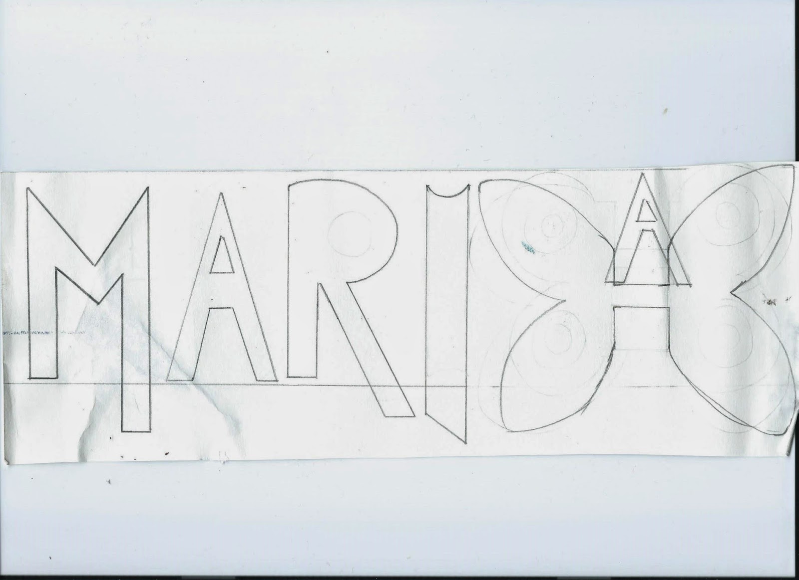
The artist is trying to communicate freedom, music, drugs, and love as he is pioneered the rock concert poster aesthetic of the late 60s , the mood and the atmosphere is fun and bright since all his posters are bright. The feeling and emotion it conveys is joy in music in the 60s and also the mystery of the letterforms that are not easy to read which it might say about the culture and the movement which is not clear and mysterious. The ideas it coveys to me is society where people want to change from the traditional life style into more free and fun society.
 
Technique
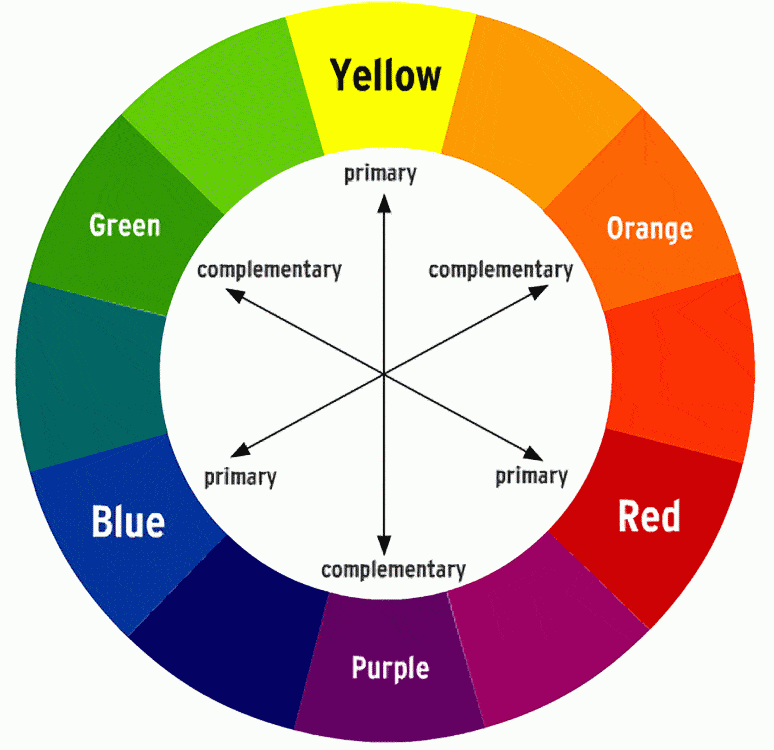
  Expanding their outlines and inset shapes at the same time he played with foregrounds and backgrounds, his design patterns becoming increasingly exaggerated with each new creation Wilson's other major breakthrough was in his use of colour inspired by the light shows of the concerts themselves, he mixed colours with wild abandon, resulting in jolting visuals that perfectly captured the revolutionary essence of the music his art promoted. I think Wilson drew the shapes than started printing I believe he used ink the marks were carefully applied, the consistency of the ink is thin, the poster creates illusion that some forms are further away from others the use of colour is exaggerated very vibrate bright and vivid which resembles rock concerts. most of his posters he uses complimentary colours which are colours opposite each other in the colour wheel which makes the poster look very bright. Some posters go from light areas to dark areas the texture is smooth since is printed.
 
Artist Career
Born Robert Wesley Wilson on July 15 1937 he drew throughout childhood, but while attending the local junior college in Auburn, CA, instead studied forestry and horticulture, subsequently majoring in philosophy at San Francisco State College. He later went to work at Contact Printing, a small press that produced handbills for the Mime Troupe Appeal parties mounted by concert promoter and impresario Bill Graham soon Wilson who had already completed a handful of well-received posters for Chet Helms and the Family Dog was also designing for Graham's rock shows at the Fillmore Auditorium.


analysing wis wilsons and alphonse Mucha work

  The first thing I noticed about the poster is the colour contact as the red writing stands out against the green background, at first I thought the letterforms are flames then I looked closely realised it was writing.
The colour used is complementary colours and they are located opposite each other in the colour wheel. The letter forms are very hard to read called psychedelic font invented by Wes Wilson around 1966 which look like they were moving or melting which means you have to be in the culture to be able to read it since its made this way for not everyone to read , the use of colour is  vibrant and vivid.


  I am going to compare Alphonse Mucha right and left is Wes Wilson. From both paintings you can see some similarities such as the busy and complicated layout in Wilson poster you can see a lot of curves and different shapes you can also see letterforms that look like ocean waves they almost look moving like waves similarly with Mucha I see curves and curls  I also see the boarder very busy with different shapes of leaves and plants, you can also see circular shapes. Both painting/poster are outdoor inspired to me since Wilson has a ocean theme and Mucha has a garden theme however the use of colour is very different Mochas painting has soft romantic colours which you can find in nature while Wilsons poster the colours are opaque, strong and eye catching. Wes Wilson is trying to communicate freedom through his art work since his art is inspired by rock music drugs and love on the other hand Mucha was very much inspired by theatre and beautiful women so he painted women in  flawy hair and flowers around them.                                          


VICTOR MOSCOSO
The letterforms are bold and curved you can also see a stroke where the pen lets of at the end of the letters, all letterforms are the same height however you can see a descender  that drops below the base line all letters are san serif and you can see areas of negative space which is counter. Is different because it was not used before, people in the 60s were trying to change society into a positive change by using vibrant bright colours and by doing different shapes and typography and also by music which inspired Wilson and Moscoso.
Mocsoso ans Wilson communicate the atmosphere or the attitude of the late 1960s as anti establishment and trying to be different from society the use of neon vibrant colours is what attracts my attention the most also the 1960 was the time where people had rights and most artist felt free to express their emotions through art and this is what Wilson and Moscoso did.


Thursday, 5 June 2014

mariah carey typography cd cover (graphics)

 
MARIAH CAREY TYPOGRAPHY
CD COVER
                       
 The letter forms used in Mariah Carey's CD covers are classy, elegant and easy to read , Mariah Carey is famous for singing ballads, R&B and hip hop, the typography in her CD covers relate to her music and character which is glamour and grand also most of the typography is San Serif ,all have the same height and there is a distance between the letters (kerning).
The use of colour in the letter form is vivid and vibrant since Mariah's music is joyful and in high spirit, the colours are also very feminine the use of pinks and purples makes the letter forms look girly which suites Mariah Carey's character and music.
I started making my own letter forms for my CD cover and I wanted to do something that represents Mariah Carey to the same audience. Since butterfly's are Mariah's symbol I decided to make the 'H' look like a butterfly which makes the whole name look personalised moreover the letter forms in Mariah CD cover are colourful likewise I chose a bright neon yellow and orange which to me looks like gold, summer and sun it suites Mariah's character and music as most of her music is beach and summer inspired.


CONTRACTING AND COMPARING FILM COVERS
 
                                     I am going to comparing 'The Croods' and 'Apocalypto'
                                     since they both very different covers, 'The Croods' film cover is very
vibrant and bright that catches your attention while 'Apocalypto' dark and foggy that gives an idea of what the film is about which is death and horror. You can also see the difference in the typography used 'the Croods' title is very bold, easy to read and has a funky design which is suitable for children the main target audience, on the other hand 'Apocalypto' title looks like is fading into grey and it not bold, unlike 'The Croods' its not easy to read for children which makes the film suitable for adults.The colour choice used in the title' The Croods' is white which standout against the colourful background however 'Apocalypto' title has dark and light grey edges.
From the film covers I can gather few similarities, in both covers you can see  the character standing in the middle which creates a mid point and perspective, I can also figure out that both films are about dangerous journeys,at 'Apocalypto' I see someone being chased by many people at the back holding fire, the character at the foreground is holding a knife also in 'The Croods' the characters are all looking at the mountains which is the target , on each side you can see fierce animals which gives an idea of danger.


The Texas Chainsaw Massacre: The Beginning Movie PosterI chose to compare 'The Texas chainsaw massacre' and 'Rango', the film cover of 'The Texas chainsaw massacre' is misty and dusky. Darkness always indicates mystery and horror since the film is about a serial killer in Texas that killed over 33 people whereas 'Rango' film cover is joyful and playful I know this from the use of colour which are vivid and cheerful. The use of  typography in the film title of 'The Texas chainsaw massacre' looks very sharp and shiny as the serial killer in the film murdered people with a chainsaw which is the main theme in the movie , the audience for this film are adults because the cover and the title indicate that the film genre is horror yet 'Rango' title is bold and curvy it also look like American west writing the target audience are children and young adults.The characters in the film 'Rango look humorous and playful which indicates the film genre is comedy you can also see other characters dressed like cowboys at the background, film theme is American west. In 'Texas chainsaw massacre' I can see the use of rule of three yet in 'Rango' the character is in the middle which creates a mid point and cuts the cover in the middle. 


Wednesday, 4 June 2014

Film Cover (Graphics)

FILM COVERS
 
ARGO

The use of shredded paper is to hide or conceal identity. The covering of the eyes with Iranian flag can apply to someone taken hostage which is suitable since the film is about undercover mission, you can also see one shred is missing which may indicate a document missing, someone missing or it might implying that pieces needed to be put together in order to catch the target.
The red font stands out against the black background and the white shredded paper, the actors names are in capital and white, colour white stands out against black very well. The film name ARGO is black and very bold and it overlaps the Iranian flag which is very colourful which makes the name stands out very well.
THE CROODS

The use of bright, saturated colours appeals to children as it stands out and catches their attention. The use of distant images and depth gives hints towards a journey or adventure you can see the characters looking at the mountains which creates perspective. The title is in a rock like font and the characters are dressed in animal fur which conveying that this film is set in the stone ages. As well as the vibrant colours they further reach out to the children through the animals on both sides of the cover are colourful creatures, some looking dangerous which implies there is an element of danger/adventure throughout this film. The typography is very easy to read which is very suitable for children to read because its not complicated , its also white which stands out against the colourful background. The typography is also bold which makes it very visible to the audience.

AMERICAN HUSTLE

The use of colour in the film tile chosen to represent the classy, elegance and rich theme of casinos based in the 1960's 70s it can also represent gold and glamour. The film title includes 'Hustle' which indicates the film about crimes, gangs, Mafia and money. The typography used is also very large and bold, being the colour gold and also having the word hustle means that a large sum of money is a main point in this film. The film cover looks like a Deco card that you see in casinos which also shows that the film is about gambling.

APOCALYPTO

This film was based on murders caused by religious sacrifice in south America. The 'C' in title causing an eclipse hints towards the very reason for why all the sacrifice occurred.
The use of dark colours such as black/grey was used to convey the element of death and horror. The overall message being with darkness from the eclipse comes death. You can also see the letters are separated from each other which makes the title easy to read. The title is white which stands out against the very dark foggy background , you can also see people holding fire at the back and the eclipse they both have the same colour.