Sunday, 15 December 2013

Evaluation RED AND BLUE CHAIR

Evaluation
Red and Blue Chair 

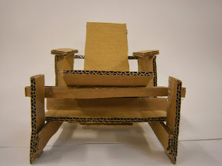
Our task was to create the Red and Blue chair using carton either 1:3 or 1:4 scale.


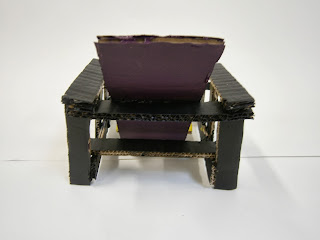
This is My chair I made from carton 1:4 size, me and my team divided the actual numbers of the real chair by 2 and then divided it again by 2, we then draw the shapes on a carton and cut them with the knife. After cutting we started sticking everything with the glue gun. The hardest part of this task was the cutting it was really hard to cut through the carton because its really thick, I cut my self once because I was putting so much pressure in the carton and my fingers slipped to the knife. To me the cutting was the most challenging part in the task. 


 I decided to paint my chair with different colours I used purple,yellow and black I think using purple against black is not very good because the black hides the purple however I really like the the yellow because its bright and it catches your eye. I think if i could paint the chair again I will use green instead of purple moreover I am happy with my chair and I think I managed my time very carefully in this task because I managed to finish my chair in time.


Red and Blue Chair


Creating the Red and Blue chair with wood really nice.

Si Scott designning


I found this really interesting video of Siscott designing.

Evaluation CITYSCAPE

Evaluation
Cityscape 


The task we had was to design a cityscape from magazines,Internet or from your own ideas on a A3 white paper .and then create it using a black sticky paper. The task at the start was very interesting because we were drawing building and designing our cityscape however it got very hard and frustrating when we started cutting using the knife I was very slow at cutting and I was not cutting in a straight line some of me cutting is very wobbly.

I made only one design for my final piece because I was happy with the outcome.My cityscape has a New york theme one of my favourite building I did on my cityscape is Chrysler Building made by an architect called William Van Alen Art Deco style  another building I really like Hearst Magazine Building made by Joseph Urban and Sir Norman Foster the rest are drawings I found in magazines that are related to New york city.

In general I am pleased with my outcome, If I had another chance to do it again I will manage my time carefully and I would practise using the knife before cutting anything I would also pay more attention to the outcome it could have been neater finally I think my cityscape has a really nice theme which is New york but the cutting could have been better.


Monday, 9 December 2013

David Downton

DAVID DOWNTON
 
 
David Downton was born in Kent, in the south of England in 1959. He studied at Canterbury ( Foundation year 1977- 1978) and Wolverhampton (BA hons illustration/graphics 1979-1981). In 1984 he moved to Brighton and began his illustration career. For the next 12 years - a period he describes as 'wagging my tail when the phone rang' - he worked on a wide variety of projects ranging from advertising and packaging to illustrating fiction, cook books and, occasionally, fashion.


In 1996 the Financial Times commissioned him to draw at the couture shows and since then David has become known principally as a fashion illustrator. His reports from the shows have been seen internationally, in the US, China, Australia and the Middle East, as well as in almost every leading UK broadsheet and supplement.
 
David’s commercial client list includes: Tiffany & Co, Bloomingdales, Barney’s, Harrods, Top Shop, Chanel, Dior, L’Oreal, Vogue, Harper’s Bazaar, V Magazine and the V&A Museum. In 1998, he began working on a portfolio of portraits from life of some of the world’s most beautiful women, including Erin O’Connor, Paloma Picasso, Catherine Deneuve, Linda Evangelista, Carmen Dell'Orefice, Iman and Dita Von Teese.
 
 
In 2007, David launched Pourquoi Pas the first ever journal of Fashion Illustration. He is a visiting Professor at London College of Fashion, and in April 2009 received an honory doctorate from the Academy of Art University, San Francisco.


Red and Blue Chair Gerrit Rietveld

RED AND BLUE CHAIR
 
Gerrit Rietveld (1888-1964), a Dutch furniture designer and architect, created his Red-Blue Chair in 1917, but the bright colours and, indeed the name by which it became known, were not adopted until several years later.Originally made in plain beech wood, the design was deliberately kept as simple as possible because Rietveld wanted it to be mass-produced rather than crafted by hand. The pieces of wood that are used are all in the standard measurements of lumber that was available at the time.
 
Two years after making the chair, Rietveld joined the De Stijl movement and it was under the auspices of its most famous member, Piet Mondrian that, in 1923, the chair was painted in the distinctive colours of red, yellow, blue and black.The De Stijl movement was founded in 1917 and its members believed in pure abstraction by reducing pieces to their essential forms and pure colours. Furniture was simplified to horizontal and vertical lines and they used only the primary colours with black and white.
 
Frame in black stained beech seat blue and back red in lacquered multi plywood
Height: 88cm Seat height: 33cm x Width: 65.5cm x Depth: 83cm

"The chair (read Red and Blue Chair) was specifically built to show that it is possible to create something beautiful, a spatial creation, with simple machine- processed parts. I cut a board of wood into planks and squares. I then sawed the middle part into two for the seat and the backrest, and I made the frame part out of the different lengths of plank. But as I was working on the chair, it never crossed my mind that one day it would become so significant that it would even influence architecture." Gerrit Rietveld, about the Red and Blue Chair.


The movement reached its apotheosis between 1923-24, when Rietveld designed a house for Dutch socialite Truus Schröder and her three children in Utrecht, Netherlands. The Rietveld Schröder House, as it became known, is the only building to have been made completely according to the De Stijl movement’s principles.

Schröder, who was closely involved in the design, requested the house be made without interior walls as she wanted a connection between the inside and outside. There was an open-plan layout downstairs, while upstairs could be divided by a system of sliding and revolving panels giving almost endless permutations to the space.
The Rietveld chair fitted in perfectly and appeared to float on the black floors.
Schröder lived there until her death in 1985 and the house was later opened as a museum.